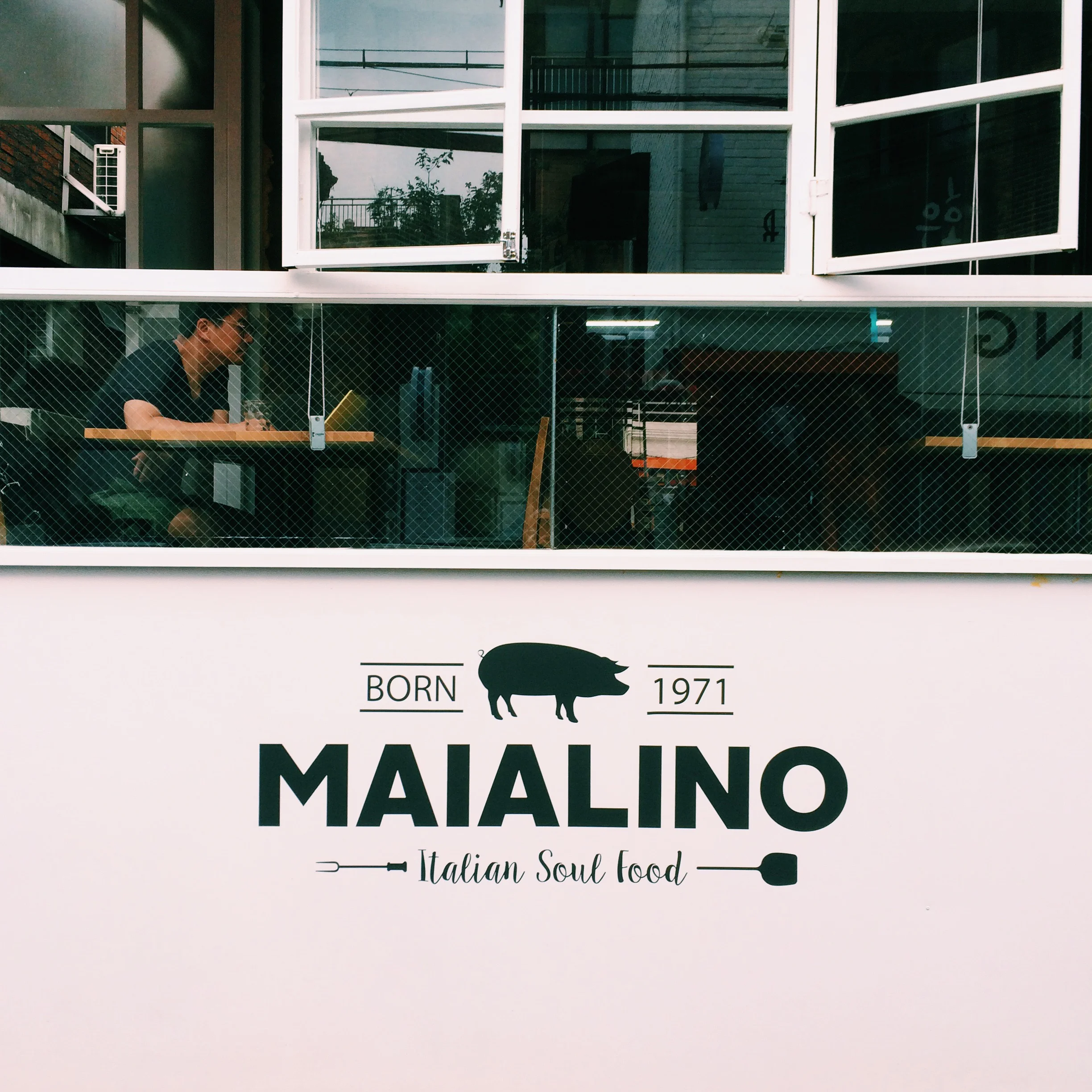
Seoul Streetscapes
As I mentioned in a previous post, we didn't really have very many expectations of Seoul before we visited the city. It's not that we weren't excited to go. It's just that we were viewing it as an adoption trip rather than a pleasure trip.
Happily, it turned out to be both. And one of my favorite observations was how design-forwardSeoul was. Everywhere we went, we encountered beautifully conceptualized cafes, boutiques and restaurants with strong visual themes. Here are a few of our favorite snapshots:
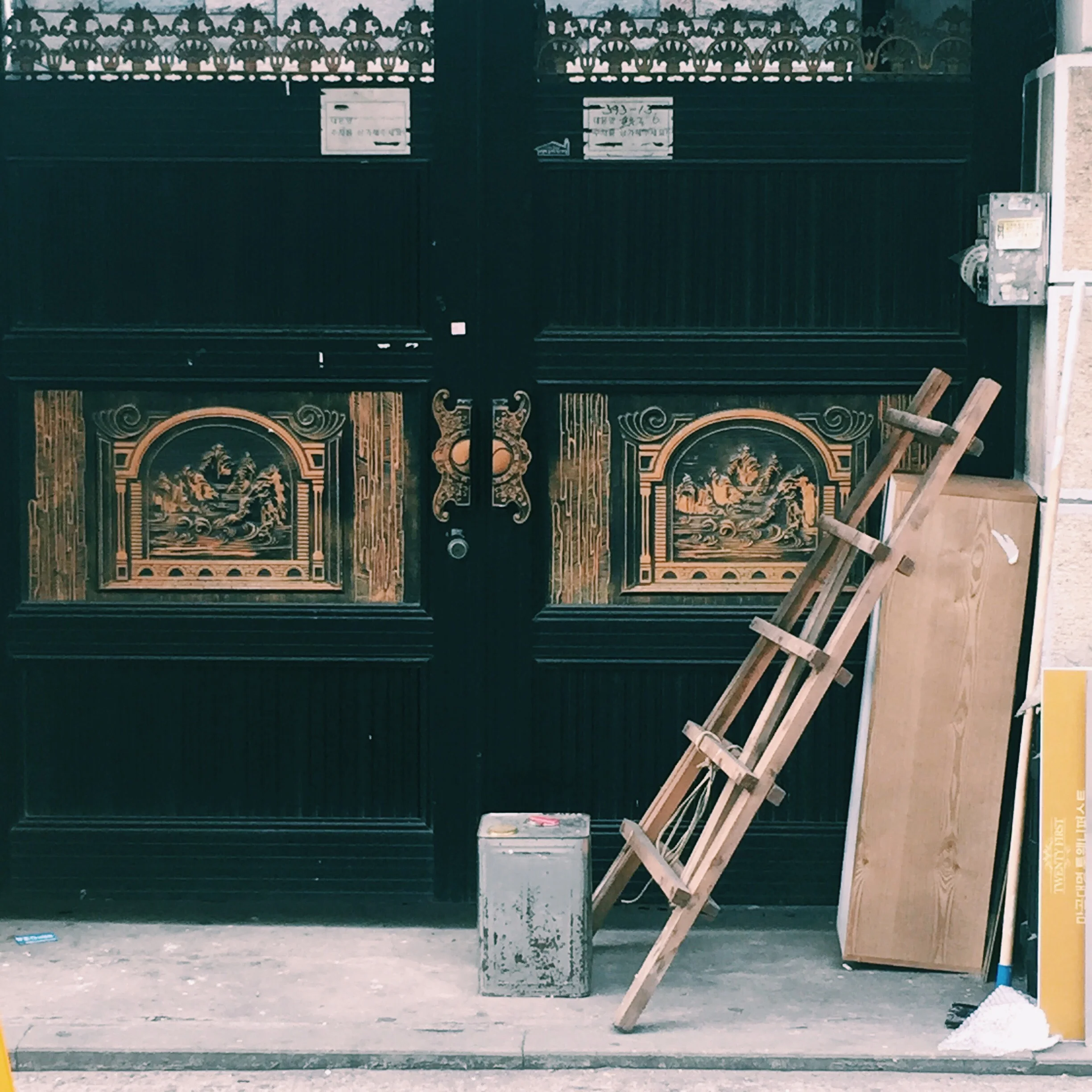
1. A Random Window
This looked to be a residential set of doors in the middle of the city, possibly undergoing some restoration.
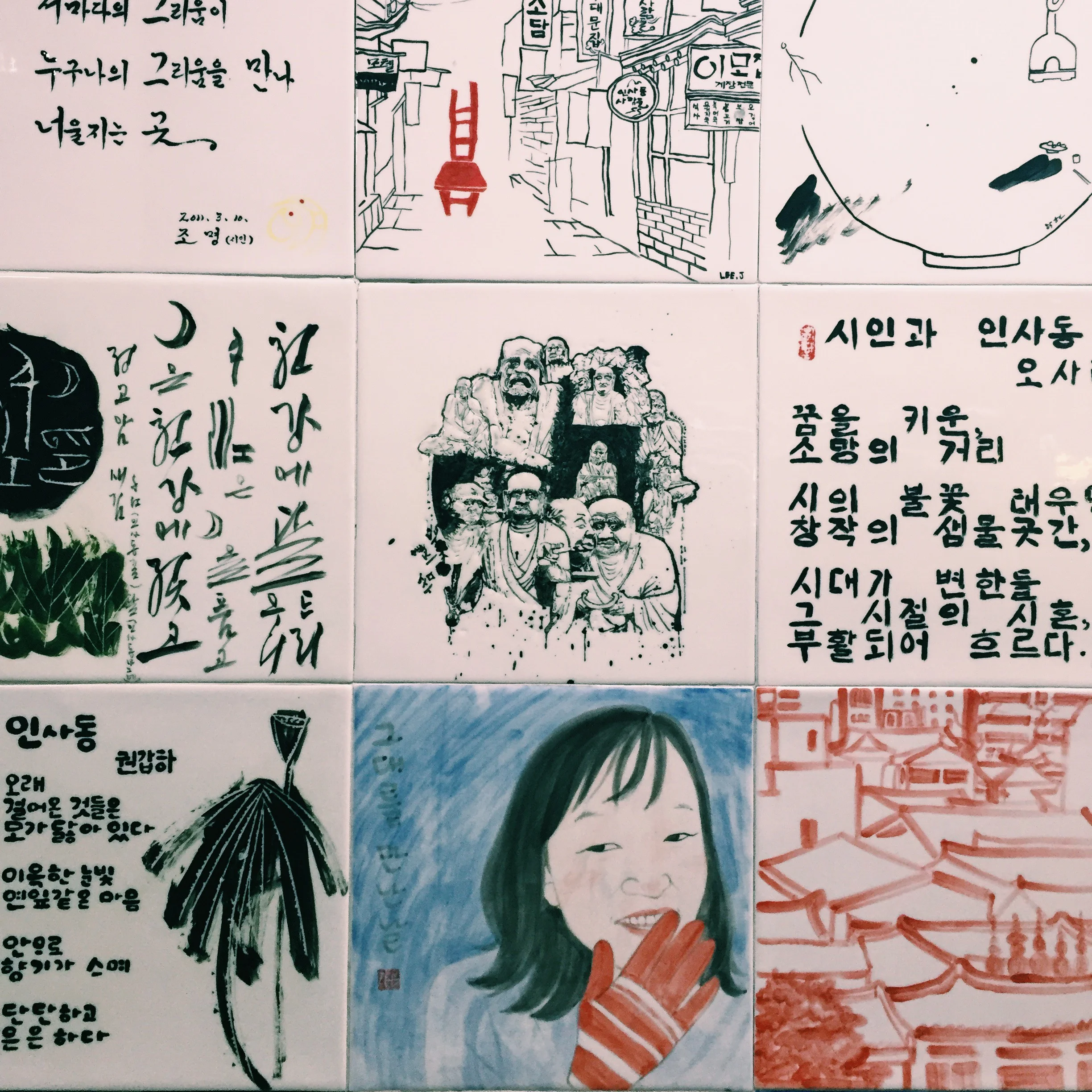
2. Handpainted Subway Tile
And not the kind you put on your backsplash, either.
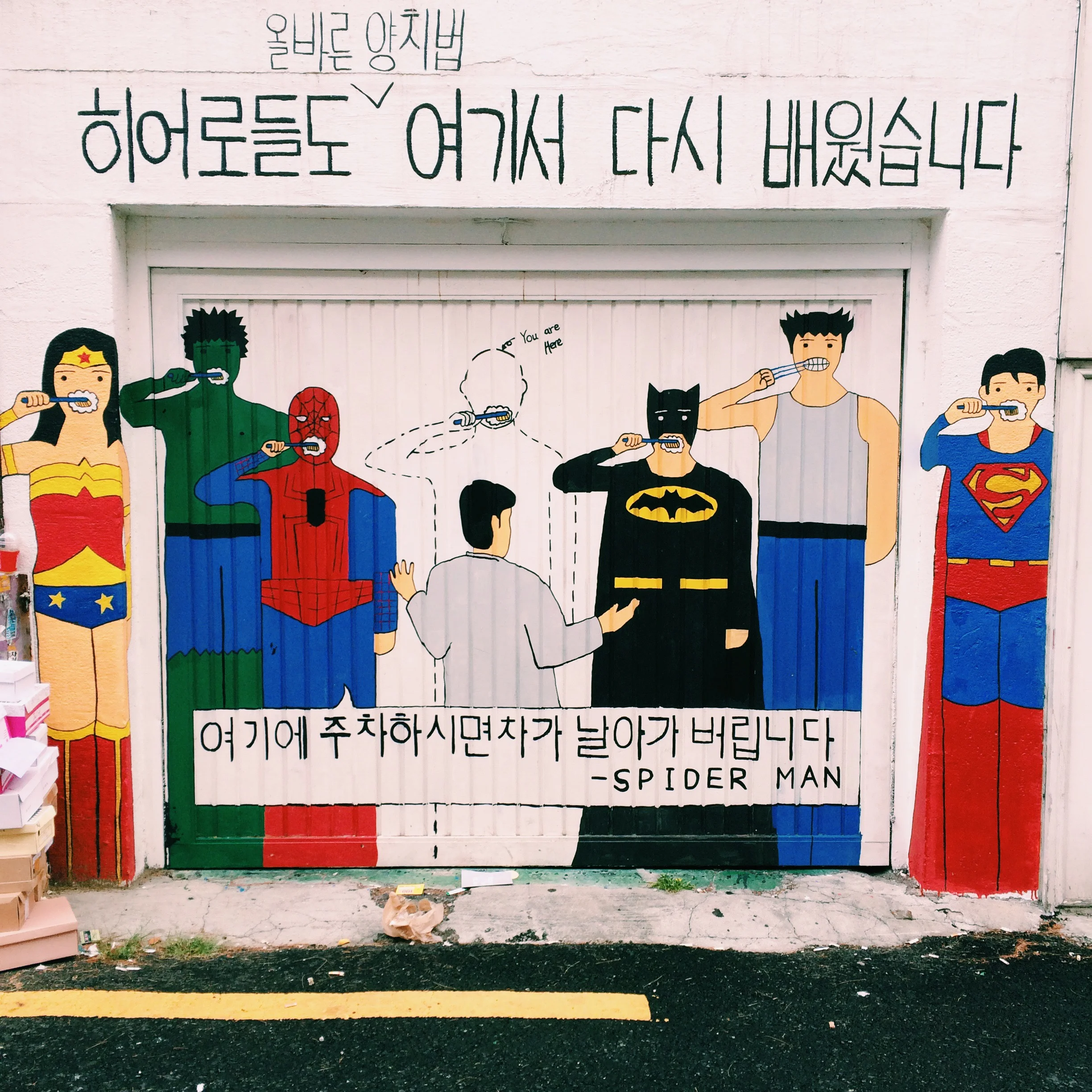
3. The Front Entrance To a Dentist's Office
My spidey sense tells me these heroes want you to brush and floss every day.
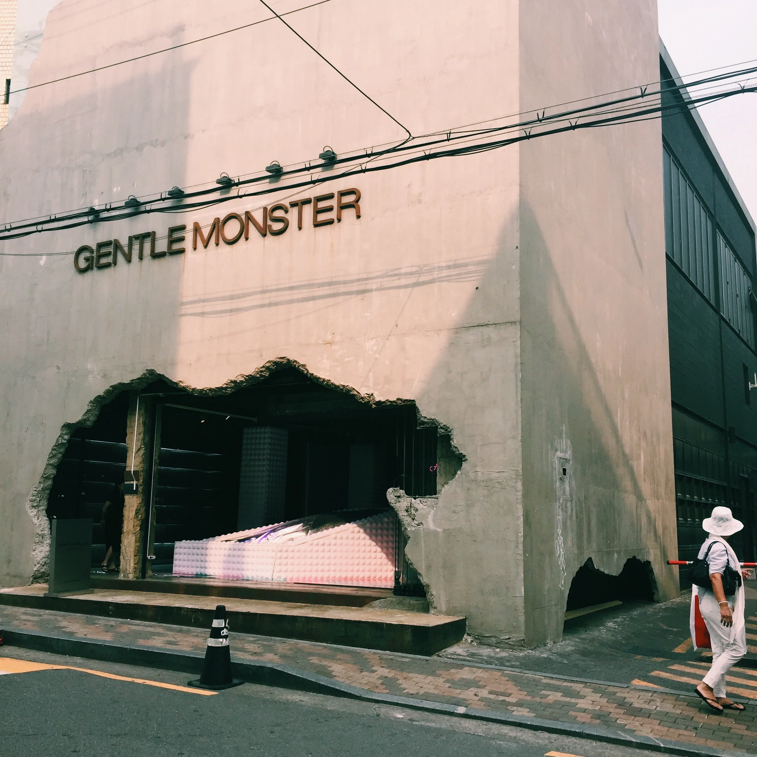
4. A High-Concept Sunglasses Store
See that passerby? That's how everyone who walked by seemed to react to this place which looked more monstrous than gentle, thanks to the faux-explosion-riddled facade.
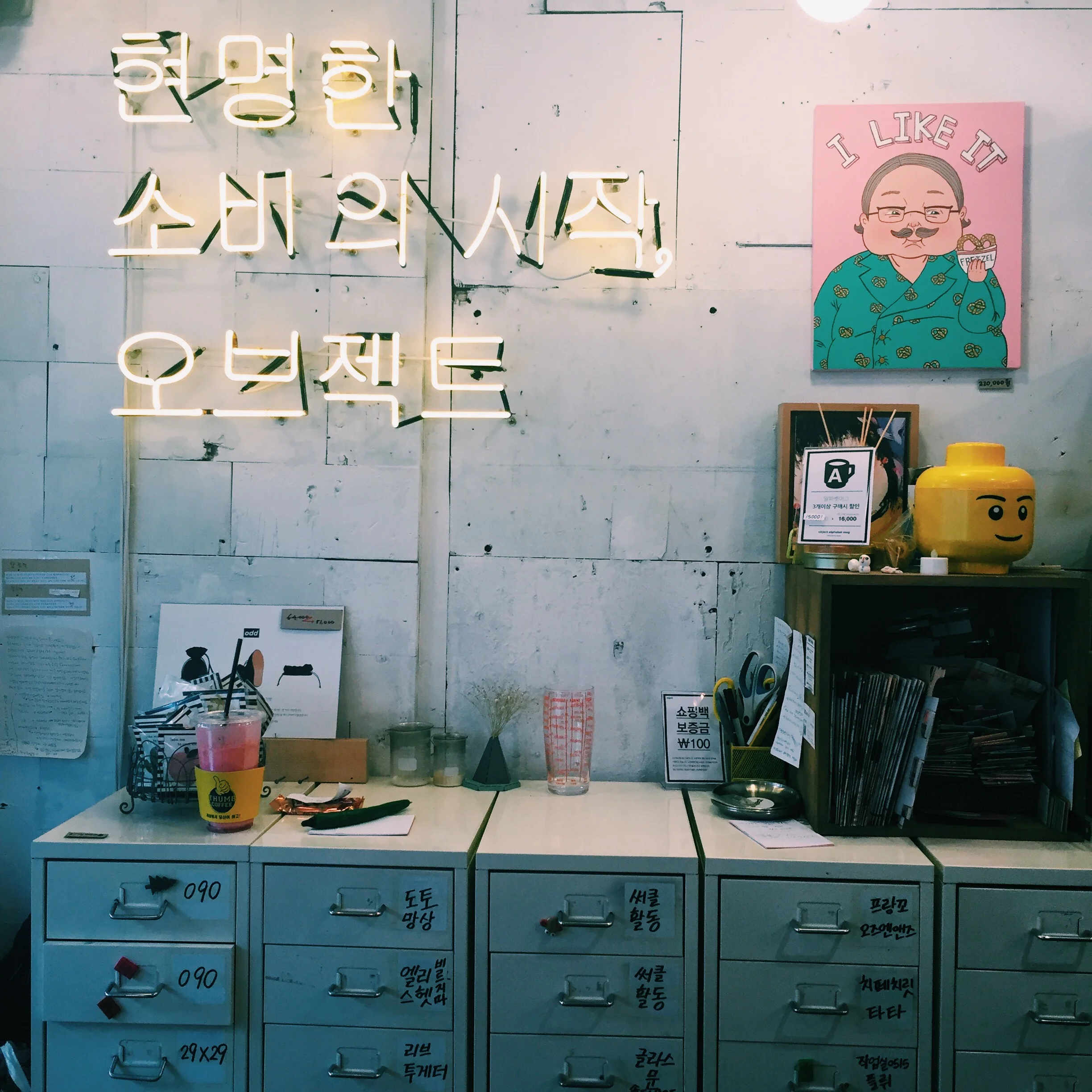
5. A Boutique Cash Register
I loved this scene, from the whitewashed backdrop to the yellow neon lights. Everything looks haphazard yet deliberately placed at the same time.
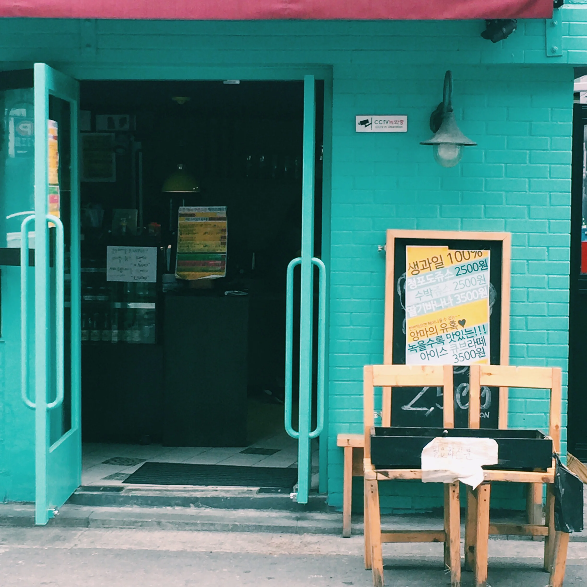
6. A Takeout Restaurant
This spot just looked so pretty with the contrast of turquoise and pink.
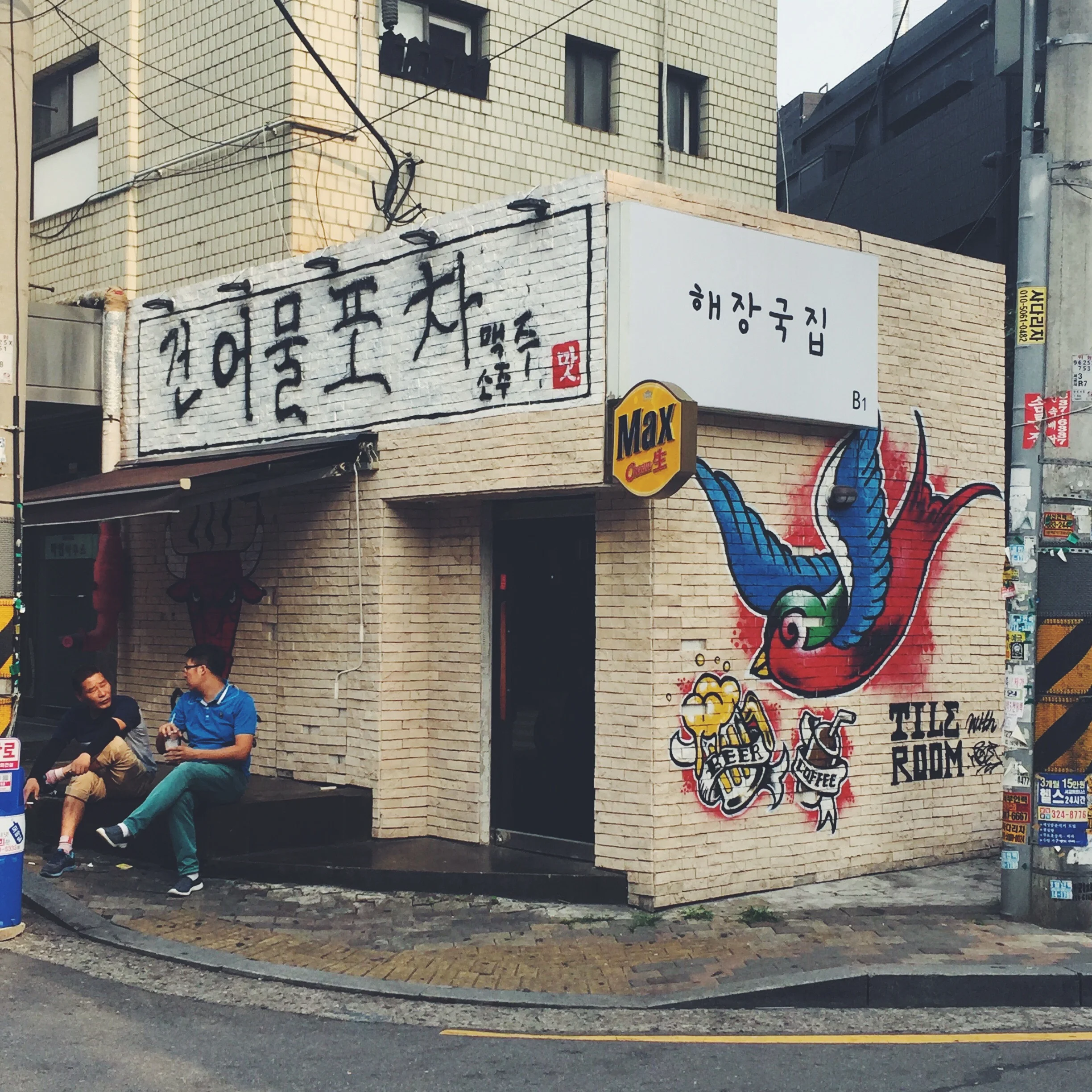
7. A Street Corner
I don't know why ... I just thought this moment (and those two guys) looked pretty cool.
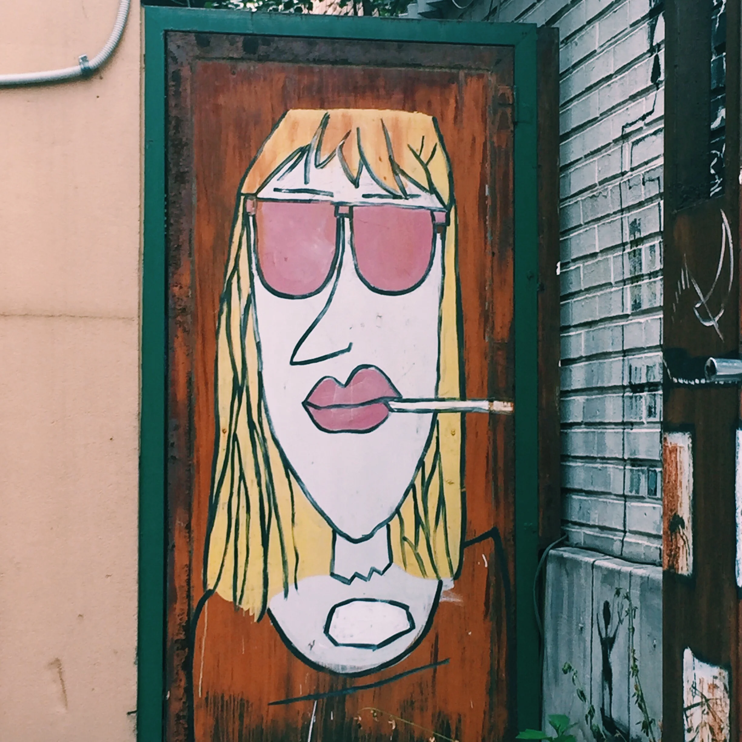
8. Art / Side Door
I found her hanging out on a side street between two restaurants. I think it was the Peter-Pan collar that called my name.


